We’ve added support for visual representation of data using Sparklines in PHP Grid Framework. Sparklines charts can be used to show trends in a series of values, such as seasonal increases or decreases, website traffic, economic cycles, or to highlight maximum and minimum values.
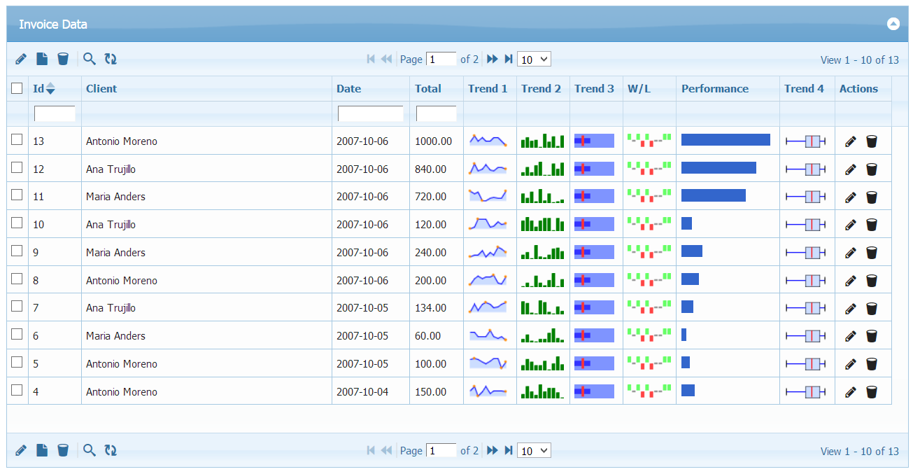
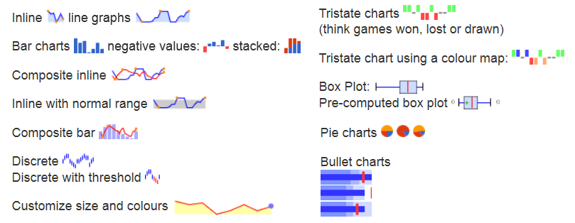
Now you can have Line, Bar, Composite (Both line/bar), Pie, Discrete, Bullet, Won-Lost, Color Map and Box Sparklines along with your other information. Few of them are shown in demo screenshot:
Licensed customers can request free upgrade using update link.
To purchase license, you can visit this link.